|
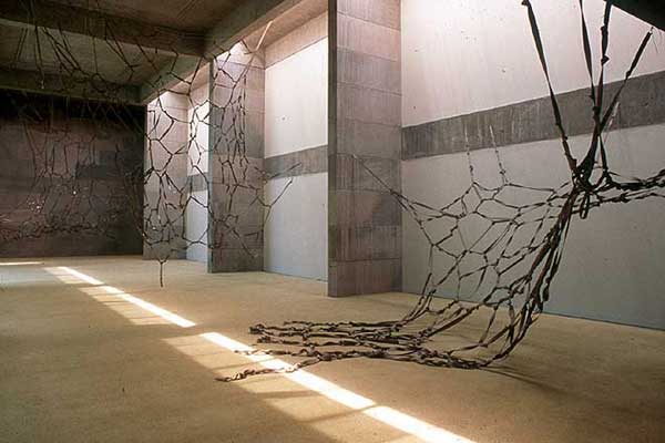
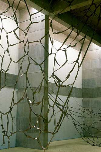
This is just after that in
2000, "Shrink," at Zilkha, and
these are industrial rubber bands and crocheted cotton cord in the
window.

There's a kind of expanded
domesticity to this. The idea of "Shrink" was to shrink
the size of the Zilkha Gallery. That's kind of a joke, because it's
this big modernist space that I felt a little bit at odds with.

I didn't quite shrink it,
but borrowing from the color of the walls, these industrial rubber
bands made for some kind of interesting drawing in space.

|